NYC Taxi Data vs NYC Theaters & Barclays Center
The NYC Taxi and Limousine commission has made available an enormous, detailed dataset, covering over 600 million taxi trips. The staggering amount of information, spanning 7 years opens the opportunity to explore transport and traffic habits of one of the most populated cities in the United States. The taxi data is enormous, at around 25G.
NYC Theaters Data vs NYC Taxi Data
New York is an extremely lively city, the home to many a theater and music venue. I wanted to look at taxi data specific to such venues. I expect to see different hourly characteristics around theaters in comparison to the mean.
I found that the number of taxi trips over a period of day shows different behavior around theaters. To prove this hypothesis we used the NYC Theaters data. This dataset has the coordinates of 117 theaters of NYC. Most of the theaters are around Midtown/Time Square and only 2 out of 117 theaters are in Queens.
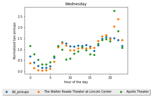
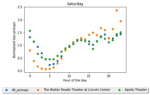
So I first we loaded the data with spark and defined a box (width=~300 meters, height=~200 meters) around the theater locations to filter the taxi trips. Since there are too many theaters in Midtown next to each other I picked some theaters out of that zone like Apollo Theater, Walter Reade Theater at Lincoln Center and 59E59. I first filtered trips for each location separately and assign a weekday/hour bin to count the total number of trips for each day of the week and hour. To be able to compare different count magnitudes and focus on the trend instead of the counts, I have normalized the counts with the mean value of each bin.
Comparison of individual theaters
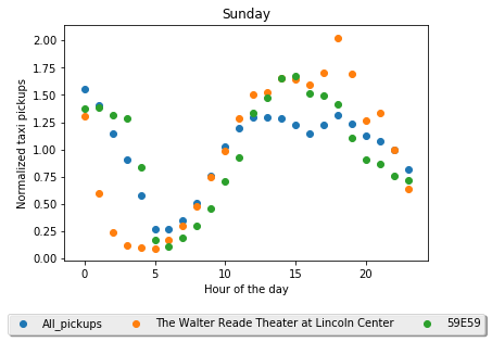
Here I show that theaters have different characteristics in terms of their taxi pickup counts. I saw different trends for different theaters. For example Apollo Theater has a pretty obvious peaks around 21pm on Wednesdays, whereas it follows the mean on saturday. Walter Reade Theater has peaks both on Wednesday and Saturday. Apollo Theater hosts many shows on Wednesdays and as expected, an there are different trends for different theaters, since their schedule change. The 59E59 theater has many shows on Sunday evenings and we can see the increase in the taxi-pickup counts. For the rest of the plots of every other day please refer to the jupyter notebook.
 |
 |
|---|---|
 |
Comparison of taxi-pickup trajectory of theaters vs all
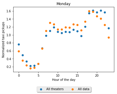
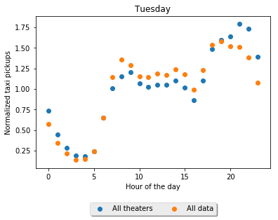
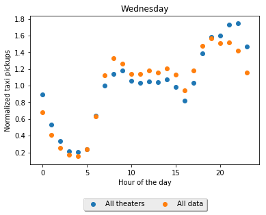
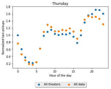
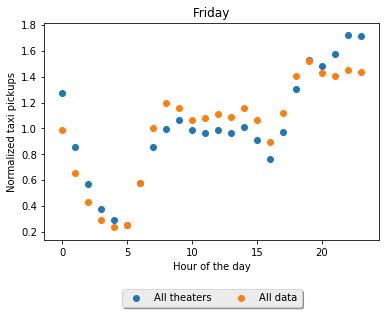
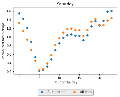
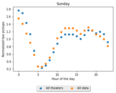
To have a bigger comparison I than filtered out all data using the all_theaters and the boxes around. I use the same box-dimensions that is used for the first part and then removed the data points which are outside of any of the boxes. Results for the seven days of the week plot below. One can clearly see that the two trajectories follow a similar trend on the day time, whereas at night, as expected, we see a significant increase in counts. This observation repeats almost in every day except on Sunday and as there are not many events on Sunday nights. But one can clearly see the increase during the Sunday afternoon.
 |
 |
|---|---|
 |
 |
 |
 |
 |
Barclays Center vs NYC-Taxi-Data
I expect a similar behavior of taxi pickups around Barclays center. So, I investigated and did indeed find a higher activity around Barclay Center in the evening!
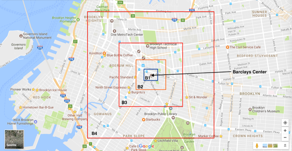
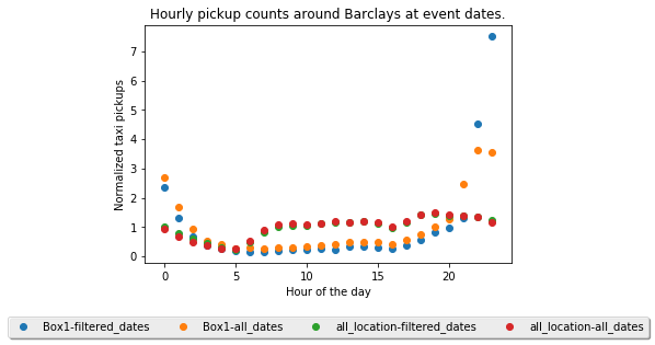
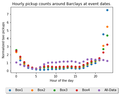
I parsed the Wikipedia page of Concerts at Barclays Center and extracted the dates of the all events. There are 179 concerts since the Barclays Center is opened in 2012 with the Jay-Z concerts. I first started with the same box size used for the previous hypothesis and filtered out the trips according to that. Than more trips are filtered out that happened other than the event-dates. Then I counted trips per hour. This process is repeated 4 times for 4 different box sizes. As expected I observed that the behavior of counts approaches to the mean as we increase the box size. This shows that Barclays center indeed has a special behavior on the event dates. I plot below the mean-normalized results. One can see that around 11pm on the event dates there are 7x more taxi pickups than the mean inside the Box-1. One can also observe that as we increase the box size the unusual behavior fades out.
After observing this unusual behavior I compared the event dates with with the all-data. On the plot below you can see the normalized hourly pickup counts of all the data (red). When I filter the data with the event dates then we get the green counts and it is almost same as the red curve. This shows that the event dates follow the general distribution. However when I repeat the same steps with the pickups happened inside the Box-1(around Barclays Center) we see that on the event dates the taxi-pickups are doubled compare to the normal trend.